

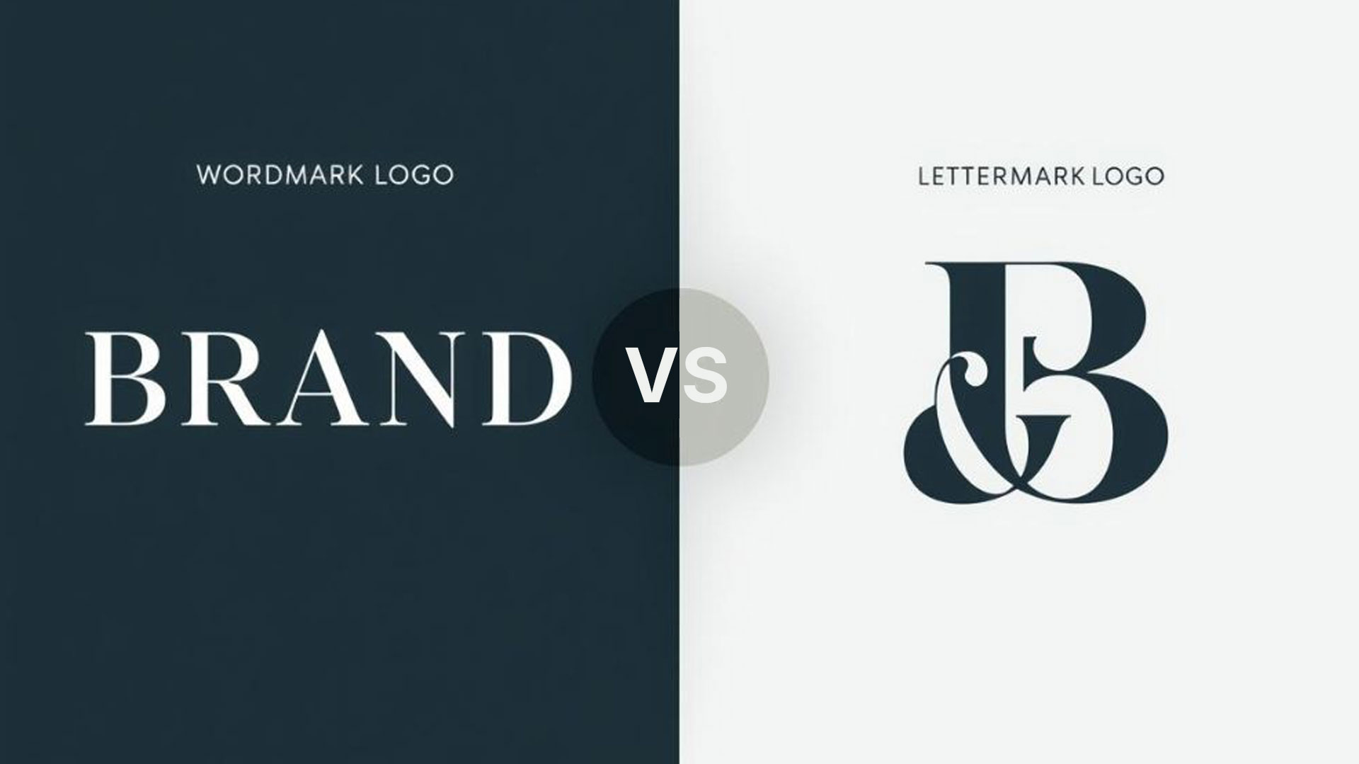
Wordmark vs. Lettermark: Choosing the Ideal Logo Style for Your Brand Identity
In the vast landscape of logo design, selecting the right style is a pivotal decision that shapes your brand’s visual identity and market perception. Two prominent and often confused styles are the wordmark logo and the lettermark logo. While both rely on typography, their application and impact on brand recognition differ significantly. Understanding these distinctions, therefore, is crucial for making an informed choice that aligns with your business goals and resonates with your target audience.
What Is a Wordmark Logo?
Known as a logotype, a wordmark is a text-based logo that exclusively features the full name of a company or brand, rendered in a distinctive and stylized font. These logos are designed to make the brand name itself the primary visual element, emphasizing direct recognition and memorability.
For example, famous wordmark logos include Google, Coca-Cola, and FedEx, where the unique typography alone is instantly identifiable. Because of this direct approach, wordmarks are particularly effective for new businesses looking to establish their name in the market or for brands with short, unique names that are easy to remember and pronounce.
What Is a Lettermark Logo?
In contrast, a lettermark logo, often referred to as a monogram, uses the initials or an abbreviation of a company’s name. This style is ideal for businesses with long or complex names that might be difficult to remember or cumbersome to display in full.
By condensing the name into a few letters, lettermarks offer a concise and often sleek visual representation. Iconic examples include IBM, CNN, and NASA. However, for a lettermark to be effective, the brand typically needs to have an established presence, or the initials must be easily recognizable within its industry.
Wordmark vs. Lettermark: A Comparative Analysis
To help you decide which logo style is best for your brand, let’s compare wordmarks and lettermarks across several key aspects:
When to Choose a Wordmark Logo
A wordmark logo is an excellent choice if:
- Your brand name is relatively short, distinctive, and easy to pronounce.
- You are a new business aiming to build strong name recognition from the outset.
- You want your brand name to be the sole focus of your visual identity.
- You desire a timeless and elegant aesthetic that relies on sophisticated typography.
If these characteristics describe your business, a wordmark may be the right choice. At Ae Graphic Elements, we craft unique and memorable text-based logos that embody your brand’s essence while strengthening recognition.
Explore our specialized Wordmark Logo Design services to learn how we can create a wordmark tailored to your brand.
When to Choose a Lettermark Logo
A lettermark logo might be more suitable if:
- Your company name is long, difficult to pronounce, or cumbersome to display in full.
- You have an established brand where your initials are already recognized.
- You prefer a minimalist, modern, and highly adaptable logo for various digital and print applications.
- You operate in an industry where abbreviations are common and easily understood.
Ultimately, the best choice depends on how you want customers to recognize and remember your business. A professional designer can help determine whether a wordmark, lettermark, or another logo style better communicates your brand’s identity and positioning.
Ae Graphic Elements: Your Partner in Logo Design
At Ae Graphic Elements, we understand the nuances of effective brand identity design. Whether you choose a compelling wordmark, a sleek lettermark, or another logo style, our team of expert designers is dedicated to creating a visual identity that truly represents your business.
In addition to logo design, we offer comprehensive logo design services, including custom wordmark logo creation. Our approach combines strategy and aesthetics to help your brand communicate clearly, create recognition, and make a lasting impression.
You must be logged in to post a comment.